
 |
Throughout the semester, I would use my limited experience with bookbinding and some wild Google searches to find a method that would allow the report to lay flat when opened. Saddle-stitching and stab binding were out of the question, as the final report would have too many pages for these techniques. Perfect-binding was far from ideal, as it didn't allow the pages to lay flat (though if I had gotten the reports perfect bound at a print shop, it would've cost less and taken much less time). Spiral-binding was not an option at all, as it lacked the aesthetic appeal and 'finished' look of a properly bound volume.
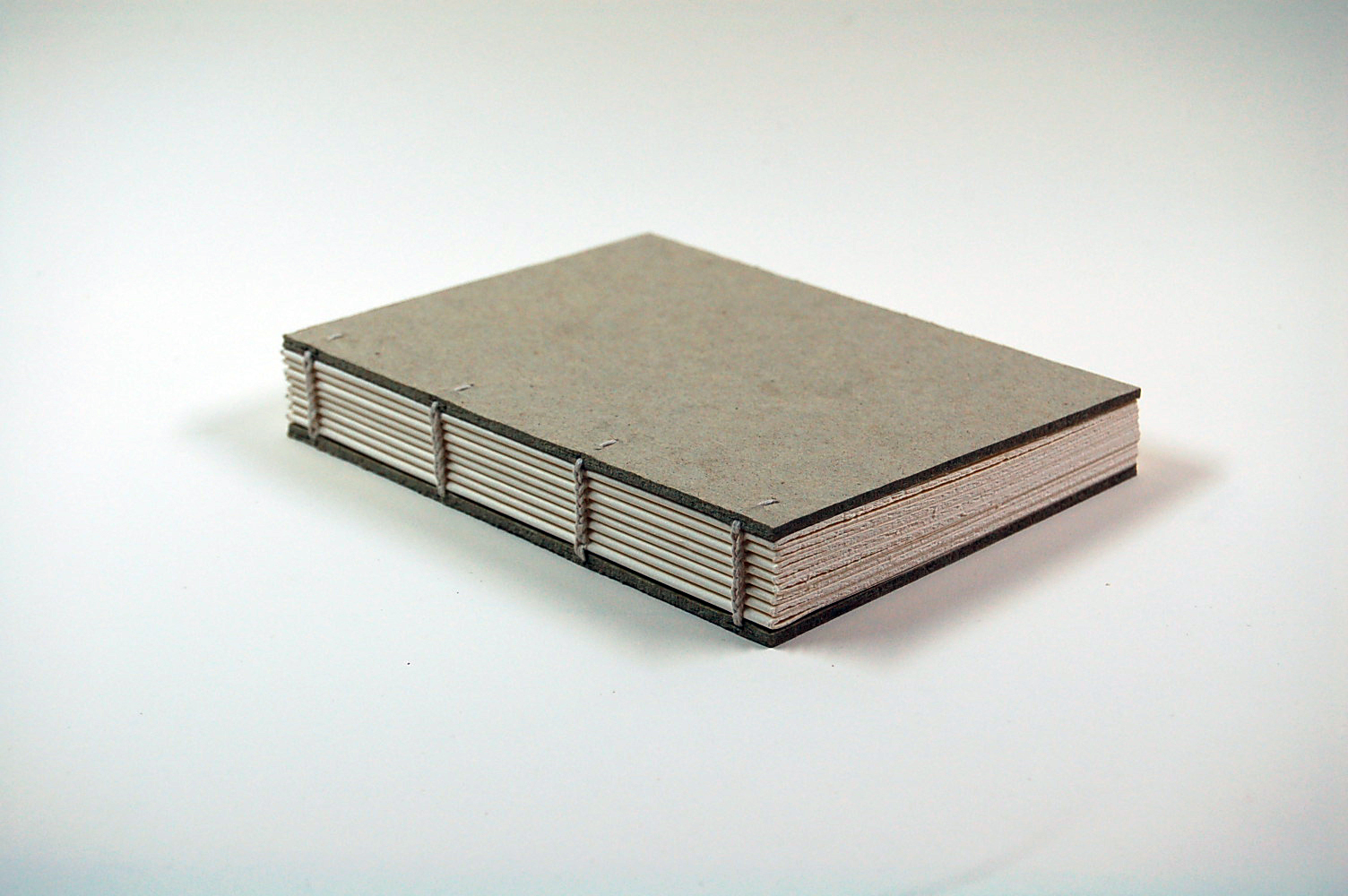
I learned about coptic binding, which results in a text block similar to that of casebound books. Coptic-bound books are intended to show off the spine. But because I wanted to silkscreen the cover, it would presumably be made of thinner stock (<300gsm) that covers the spine, making a coptic bind redundant. I looked to my bookshelf for inspiration, and noticed that Super Normal (by Naoto Fukasawa and Jasper Morrison) had the qualities I was looking for in a binding method.
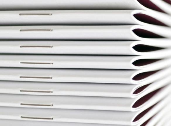
It has a soft, wraparound cover that allows the text block to 'float' when the book is opened, much like a casebound book does. It was made of signatures of four sheets, equating to 16 pages per signature. (The even distribution of pages was an important guiding factor in the text layout.) These were bound together as if the book was hardcover, a method called kettle stitch binding. There were also thin strips of double-sided tape or glue between signatures to hold the book together.
I decided to emulate this binding method, and used this tutorial by Sea Lemon to do so when the time came.
Relating to the cover, I was listening to a lot of bebop and jazz throughout the semester, and had a growing interest in the blocky, expressive shapes found in jazz art. I looked at block-prints from the 60s, and the work of graphic artist Kads Miida, and textile designer Samiro Yunoki, which have a similarly stylised, improvisational feel. This led me to the work of Saul Bass, which was a nice, sharp balance to the gritty textures of printmaking. (More of my inspirations can be found here.)


The qualities I admired about these forms were their deceptive simplicity and strong sense of personality. I felt a kind of connection with the people who put these compositions together, with all their flaws and idiosyncrasies present in the work. They were deeply human compositions, and felt alive with the characters of their creators. This made for a fitting visual language for my report, with its themes of tolerance, community, and self-expression.
I made a bunch of quick, expressive layouts on bits of paper with permanent markers, eventually getting to a layout that seemed visually balanced and highlighted the right words. I photocopied this and blew it up to three times its original size, then went over the page with bright pink marker. I laid another sheet of A4 paper on top of this and followed the pink lettering with pencil, making sure to exaggerate the shapes and make them more blocky. This made them more conducive to being cut out as a stencil later.
I went over the pencil with a black permanent marker, and scanned the page. I then traced the shapes in Illustrator to get nice, sharp results, and fine-tuned the typography to make it flow better. I then resized it to a variety of scales relative to an A4 sheet, and chose a scale that left a modest border around the typography. This was then printed and cut out to form a stencil, which I affixed to the fresh, new silkscreen.
 |
| Initial layouts on bits of paper. |
 |
| Further refinement of the chosen layout. |
 |
| Scanned, traced in Illustrator, and printed to the correct scale. |
 |
| Cutting out the stencil. |
 |
| Affixing the stencil to a new screen. I've had this screen for years and haven't used it until now. |
 |
| Looking fresh. |
Before printing on the actual cover stock, I decided to do an initial print on a piece of similar stock I had lying around. This was to 'condition' the screen for the actual prints, and also to test the stencil. For my first time silkscreening in about two years, it turned out alright. But looking closely at the test print, the green ink had bled through the thin printer paper that the stencil was cut from, meaning that some letters had patches of ink spilling over.
I realised my oversight in making the stencil; it shouldn't have been made of printer paper. Acetate would've been nice, if a little harder to cut.
 |
| The pot of ink: acrylic mixed with retarder. |
 |
| The bleed in the test print. |
I was pretty amazed when they turned out with only minor imperfections (by my slightly loosened standards at this point). I hurriedly washed the ink from the silkscreening equipment, and hung the paper up on the wall to dry.
 |
| A successful print. |
 |
| I should've probably bought another sheet in case I screwed it up. |
 |
| My ridiculous drying set-up. |
I used polyester because the store I visited had no linen thread (the preferred choice for bookbinding). The set of needles which I bought there didn't get used for binding, as they were too big. I ended up bending a normal sewing needle into a curve, which did the job really well.
The binding itself was relatively easy once I wrapped my head around how it worked. It took a while to do, but I kept myself entertained with Tested's Still Untitled: The Adam Savage Project, some of my favourite all-nighter listening material. They discuss a lot of stuff, like the maker movement, current films, the film industry, travel, the city of San Francisco (where they're based), and personal experiences of the cast members.
 |
| Carefully folding the signatures with a bone folder. |
 |
| The polyester thread and some needles I didn't end up using. |
 |
| Kettle stitch binding. |
 |
| The finished text blocks. |
I measured the thickness of the spine, and ensuring the screen prints were aligned correctly, cut out the covers and scored lines where the bends would be. I folded the cover in those places to prepare them for installation.
After that, I double-sided taped the cover to the text block, and the reports were done.
 |
| The completed reports! |
 |
| Woo! |
However, I had developed a sense of certainty early in the semester that I would silkscreen the cover and bind the reports in a special way. It became impossible for me to present a spiral-bound report straight from the print shop.
I was aware of how intense an undertaking it would be, and how easily it could all fall apart. It was a close call with the silkscreening because I hadn't refreshed my memory of the process. And it's always easy to misjudge a measurement while cutting, or to mess up your layout in InDesign. I'm guessing that a whole heap of luck got me through successfully.
What's important to note here is if I hadn't been so intent on presenting the report in this way, I may not have had the same level of motivation to work on the research in the first place. I feel as if somewhere in my head, I entangled the design of the physical report with the goals of my research. The two concepts became deeply related, and one would only go on if the other did too.
I can now see that the increased risk of failure was worth the drive it gave me to push the whole thing further, and the satisfaction of having made something I'm truly proud of.






0 comments:
Post a Comment